Going beyond builtin#
The pyglotaran-extras are a utility library enabling users to quickly inspect and visualize
results from pyglotaran in the most common ways we know of.
However since specific needs can vary a lot on a case by case basis and we can’t possibly anticipate all user needs.
Thus it is important that you as a user are familiar with the usage of the underlying libraries
that the pyglotaran-extras package uses to facilitate its functionality and be able to help yourself.
Giving a user a plot will fit their needs for this case, teaching a user how to create their own plots will help them with all their needs.
Basics of working with xarray#
The xarray library is the backbone of how pyglotaran stores result data, which is why it is
important to know how to work with it.
Let’s start by creating an example Result by utilizing the simulation capabilities of pyglotaran
and the included example test data.
from glotaran.testing.simulated_data.parallel_spectral_decay import SCHEME
from glotaran.optimization.optimize import optimize

result = optimize(SCHEME)
   Iteration     Total nfev        Cost      Cost reduction    Step norm     Optimality
       0              1         7.4817e+00                                    4.25e+01
       1              2         7.4813e+00      3.90e-04       2.76e-04       4.37e-02
       2              3         7.4813e+00      3.31e-10       5.49e-07       1.45e-05
`ftol` termination condition is satisfied.
Function evaluations 3, initial cost 7.4817e+00, final cost 7.4813e+00, first-order optimality 1.45e-05.
Inspecting result data#
Before we can select data we first need to know which data we actually have.
So let’s have a look at the data attribute of our example Result
result.data
{'dataset_1': <xarray.Dataset>}
dataset_1
<xarray.Dataset> Size: 6MB
Dimensions:                                              (time: 2100,
                                                          spectral: 72,
                                                          left_singular_value_index: 72,
                                                          singular_value_index: 72,
                                                          right_singular_value_index: 72,
                                                          clp_label: 3,
                                                          species: 3,
                                                          component_megacomplex_parallel_decay: 3,
                                                          species_megacomplex_parallel_decay: 3,
                                                          to_species_megacomplex_parallel_decay: 3,
                                                          from_species_megacomplex_parallel_decay: 3)
Coordinates:
  * time                                                 (time) float64 17kB ...
  * spectral                                             (spectral) float64 576B ...
  * clp_label                                            (clp_label) <U9 108B ...
  * species                                              (species) <U9 108B '...
  * component_megacomplex_parallel_decay                 (component_megacomplex_parallel_decay) int64 24B ...
    rate_megacomplex_parallel_decay                      (component_megacomplex_parallel_decay) float64 24B ...
    lifetime_megacomplex_parallel_decay                  (component_megacomplex_parallel_decay) float64 24B ...
  * species_megacomplex_parallel_decay                   (species_megacomplex_parallel_decay) <U9 108B ...
    initial_concentration_megacomplex_parallel_decay     (species_megacomplex_parallel_decay) float64 24B ...
  * to_species_megacomplex_parallel_decay                (to_species_megacomplex_parallel_decay) <U9 108B ...
  * from_species_megacomplex_parallel_decay              (from_species_megacomplex_parallel_decay) <U9 108B ...
Dimensions without coordinates: left_singular_value_index,
                                singular_value_index, right_singular_value_index
Data variables: (12/20)
    data                                                 (time, spectral) float64 1MB ...
    data_left_singular_vectors                           (time, left_singular_value_index) float64 1MB ...
    data_singular_values                                 (singular_value_index) float64 576B ...
    data_right_singular_vectors                          (spectral, right_singular_value_index) float64 41kB ...
    residual                                             (time, spectral) float64 1MB ...
    matrix                                               (time, clp_label) float64 50kB ...
    ...                                                   ...
    irf_center                                           float64 8B 0.3
    irf_width                                            float64 8B 0.1
    decay_associated_spectra_megacomplex_parallel_decay  (spectral, component_megacomplex_parallel_decay) float64 2kB ...
    a_matrix_megacomplex_parallel_decay                  (component_megacomplex_parallel_decay, species_megacomplex_parallel_decay) float64 72B ...
    k_matrix_megacomplex_parallel_decay                  (to_species_megacomplex_parallel_decay, from_species_megacomplex_parallel_decay) float64 72B ...
    k_matrix_reduced_megacomplex_parallel_decay          (to_species_megacomplex_parallel_decay, from_species_megacomplex_parallel_decay) float64 72B ...
Attributes:
    source_path:                      dataset_1.nc
    model_dimension:                  time
    global_dimension:                 spectral
    root_mean_square_error:           0.009947788261906723
    weighted_root_mean_square_error:  0.009947788261906723
dataset_scale: 1From the first look we can see that the Result only contains a single dataset named dataset_1.
For ease of use let’s assign it to a variable ds and have a closer look.
ds = result.data["dataset_1"]
ds
<xarray.Dataset> Size: 6MB
Dimensions:                                              (time: 2100,
                                                          spectral: 72,
                                                          left_singular_value_index: 72,
                                                          singular_value_index: 72,
                                                          right_singular_value_index: 72,
                                                          clp_label: 3,
                                                          species: 3,
                                                          component_megacomplex_parallel_decay: 3,
                                                          species_megacomplex_parallel_decay: 3,
                                                          to_species_megacomplex_parallel_decay: 3,
                                                          from_species_megacomplex_parallel_decay: 3)
Coordinates:
  * time                                                 (time) float64 17kB ...
  * spectral                                             (spectral) float64 576B ...
  * clp_label                                            (clp_label) <U9 108B ...
  * species                                              (species) <U9 108B '...
  * component_megacomplex_parallel_decay                 (component_megacomplex_parallel_decay) int64 24B ...
    rate_megacomplex_parallel_decay                      (component_megacomplex_parallel_decay) float64 24B ...
    lifetime_megacomplex_parallel_decay                  (component_megacomplex_parallel_decay) float64 24B ...
  * species_megacomplex_parallel_decay                   (species_megacomplex_parallel_decay) <U9 108B ...
    initial_concentration_megacomplex_parallel_decay     (species_megacomplex_parallel_decay) float64 24B ...
  * to_species_megacomplex_parallel_decay                (to_species_megacomplex_parallel_decay) <U9 108B ...
  * from_species_megacomplex_parallel_decay              (from_species_megacomplex_parallel_decay) <U9 108B ...
Dimensions without coordinates: left_singular_value_index,
                                singular_value_index, right_singular_value_index
Data variables: (12/20)
    data                                                 (time, spectral) float64 1MB ...
    data_left_singular_vectors                           (time, left_singular_value_index) float64 1MB ...
    data_singular_values                                 (singular_value_index) float64 576B ...
    data_right_singular_vectors                          (spectral, right_singular_value_index) float64 41kB ...
    residual                                             (time, spectral) float64 1MB ...
    matrix                                               (time, clp_label) float64 50kB ...
    ...                                                   ...
    irf_center                                           float64 8B 0.3
    irf_width                                            float64 8B 0.1
    decay_associated_spectra_megacomplex_parallel_decay  (spectral, component_megacomplex_parallel_decay) float64 2kB ...
    a_matrix_megacomplex_parallel_decay                  (component_megacomplex_parallel_decay, species_megacomplex_parallel_decay) float64 72B ...
    k_matrix_megacomplex_parallel_decay                  (to_species_megacomplex_parallel_decay, from_species_megacomplex_parallel_decay) float64 72B ...
    k_matrix_reduced_megacomplex_parallel_decay          (to_species_megacomplex_parallel_decay, from_species_megacomplex_parallel_decay) float64 72B ...
Attributes:
    source_path:                      dataset_1.nc
    model_dimension:                  time
    global_dimension:                 spectral
    root_mean_square_error:           0.009947788261906723
    weighted_root_mean_square_error:  0.009947788261906723
dataset_scale: 1Accessing data inside of a dataset#
When looking at the Data Variables we can see that we have variable called fitted_data which are 2D data
with the dimensions time and spectral.
We can access this data variable in 3 ways:
Attribute style accessing with
ds.fitted_dataDict like accessing with
ds["fitted_data"]Via
data_varsusingds.data_vars["fitted_data"]
Those three ways to access fitted_data are equivalent and give you the same data.
print(f'{ds.fitted_data.equals(ds["fitted_data"])=}')
print(f'{ds.fitted_data.equals(ds.data_vars["fitted_data"])=}')
ds.fitted_data.equals(ds["fitted_data"])=True
ds.fitted_data.equals(ds.data_vars["fitted_data"])=True
Basic plotting#
Now that we know how to access the data we are interested in, let’s plot them.
Lucky for us xarray comes with built in convenience functionality that lets us quickly have a look at the data.
For data with up to two dimensions xarray is pretty good guessing what we want to plot by simply
calling the plot attribute on our data.
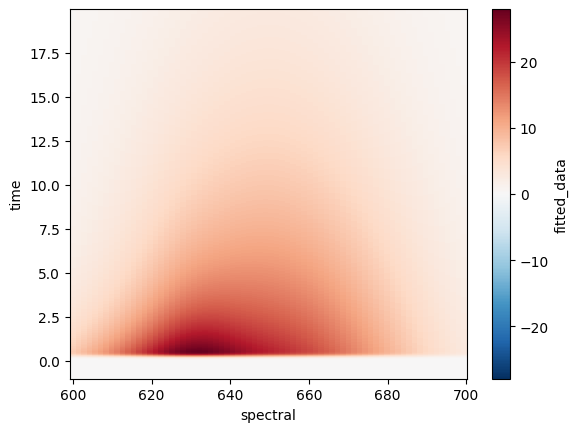
ds.fitted_data.plot();
Note
We added the ; at the end so the underlying structure of the python object which .plot() returns won’t distract us.
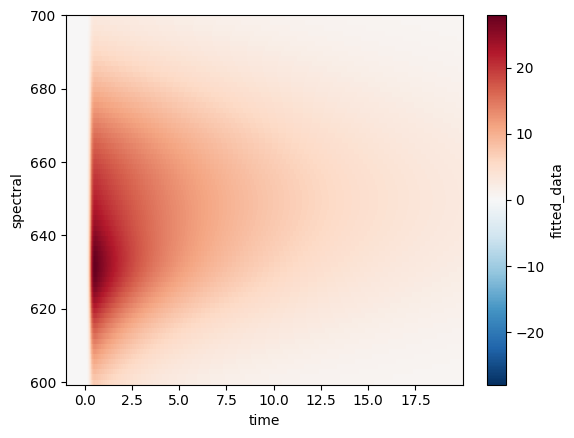
If we rather want time to be on the x-axis we can simply tell xarray so.
ds.fitted_data.plot(x="time");
While a 2D plot is pretty to look at, it often doesn’t provide us with enough detail and we would rather see multiple lines plotted.
This can easily be achieved by telling xarray which kind of plot we want rather than letting it
guess based on the dimensionality of our data.
Since we want to plot lines we will use .line method on the plot attribute.
Note
Since we have 2D data it is now required to tell xarray over which dimension we want to plot
so it can create a separate line of each data point along the other dimension.
ds.fitted_data.plot.line(x="time", add_legend=False);
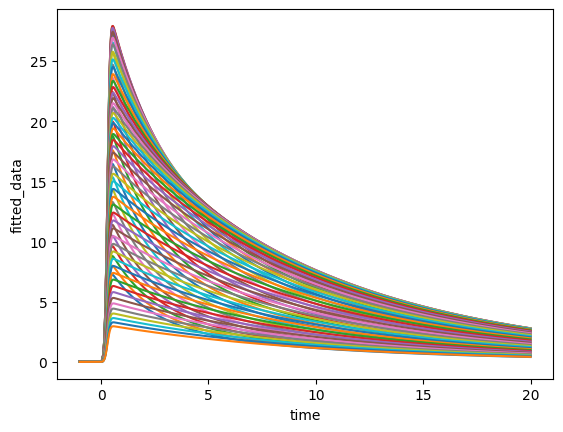
Even though we now have a line plot this isn’t what we wanted because each point on the spectral
dimension resulted in its own line, leaving us with a plot that contains 72 lines.
Data selection#
To reduce the number of lines we need to select a subset of our data based on the values of a dimension.
The xarray library provides two main ways to select data:
.sel()- Select by dimension label values (e.g., select a specific wavelength).isel()- Select by dimension index (e.g., select the 5th time point)
Let’s start with selecting a single wavelength from our fitted data using .sel().
Since we have discrete wavelength values, we need to use the method="nearest" parameter to find
the closest match to our desired value.
ds.fitted_data.sel(spectral=0, method="nearest").plot();
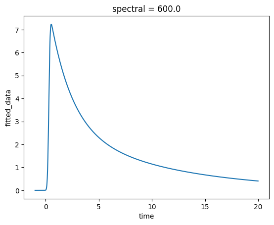
Much better! Now we have a single trace showing how the fitted data changes over time at a specific wavelength.
We can also select multiple values at once by passing a list. This is particularly useful when
working with categorical dimensions like species.
ds.sel(species=["species_1", "species_2"]).species_associated_spectra.plot.line(x="spectral");
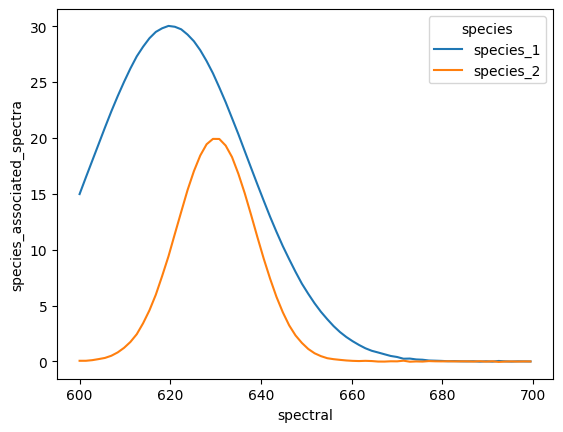
Now we can clearly see the individual species associated spectra for the selected species.
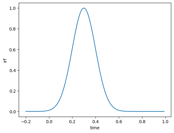
When you want to select data by position rather than by label, use .isel() (index select).
This is especially useful when working with slices to select ranges of data. For example, let’s plot a subset of our IRF data from time index 80 to 200.
ds.isel(time=slice(80, 200)).irf.plot();
Modifying coordinates#
Sometimes you need to transform the coordinate values themselves rather than just selecting subsets of data.
A common use case is shifting the time axis so that time zero corresponds to the IRF location.
The pyglotaran-extras package provides helper functions like extract_irf_location() to make
this easier. Let’s extract the IRF location and shift the time coordinates accordingly.
from pyglotaran_extras.plotting.utils import extract_irf_location

irf_location = extract_irf_location(ds)
ds_shifted = ds.copy()
ds_shifted["time"] = ds.time - irf_location
ds_shifted.isel(time=slice(80, 200)).irf.plot();

By combining .sel(), .isel() and the various plotting methods, you can create customized
visualizations that exactly fit your analysis needs.
Tip
You can chain selections together: ds.sel(species="species_1").isel(time=slice(0, 100))
to first select by label and then by index.
Working with cyclers#
One of the most common plot customizations besides data selection is changing the plot style.
Note
For more information on how to use cycler have a look at the matplotlib documentation.
from cycler import cycler
from pyglotaran_extras.plotting.style import PlotStyle
from pyglotaran_extras.inspect import inspect_cycler
Inspecting the default cycler#
The pyglotaran-extras package comes with a built-in PlotStyle that defines a default cycler used by all plotting functions.
The inspect_cycler function lets us visualize the properties of a cycler as a table, including a small preview of each line style. Let’s have a look at the default one.
inspect_cycler(PlotStyle().cycler)
| color | preview | |
|---|---|---|
| 0 | ColorCode.black |  |
| 1 | ColorCode.red |  |
| 2 | ColorCode.blue |  |
| 3 | ColorCode.green |  |
| 4 | ColorCode.magenta |  |
| 5 | ColorCode.cyan |  |
| 6 | ColorCode.yellow |  |
| 7 | ColorCode.green4 |  |
| 8 | ColorCode.orange |  |
| 9 | ColorCode.brown |  |
| 10 | ColorCode.grey |  |
| 11 | ColorCode.violet |  |
| 12 | ColorCode.turquoise |  |
| 13 | ColorCode.maroon |  |
| 14 | ColorCode.indigo |  |
That’s quite a lot of entries! Let’s check exactly how many styles are defined in the default cycler.
len(PlotStyle().cycler)
15
Slicing a cycler#
For many plots we only need a handful of styles. Just like a Python list, a Cycler can be sliced
to create a smaller subset. Let’s create a small_cycler containing only the first 3 entries.
small_cycler = PlotStyle().cycler[:3]
inspect_cycler(small_cycler)
| color | preview | |
|---|---|---|
| 0 | ColorCode.black | |
| 1 | ColorCode.red | |
| 2 | ColorCode.blue | |
Repeating a cycler#
If you need the same set of styles to repeat, you can multiply a cycler by an integer. This simply concatenates the cycler with itself the given number of times.
inspect_cycler(small_cycler * 2)
| color | preview | |
|---|---|---|
| 0 | ColorCode.black | |
| 1 | ColorCode.red | |
| 2 | ColorCode.blue | |
| 3 | ColorCode.black | |
| 4 | ColorCode.red | |
| 5 | ColorCode.blue | |
Adding properties with +#
The + operator performs an element-wise combination of two cyclers of equal length.
This is useful when you want to add a new property (e.g. linestyle) to an existing cycler.
Since element-wise addition requires both cyclers to have the same length, we multiply the
single-entry linestyle cycler by len(small_cycler) to match sizes first.
inspect_cycler(small_cycler + cycler(linestyle=[":"]) * len(small_cycler))
| color | linestyle | preview | |
|---|---|---|---|
| 0 | ColorCode.black | : |  |
| 1 | ColorCode.red | : |  |
| 2 | ColorCode.blue | : |  |
Combining cyclers with * (outer product)#
The * operator between two cyclers creates an outer product, generating all possible
combinations of both cyclers’ entries.
When one of the cyclers has a single entry, the result simply applies that property to every entry
of the other cycler — similar to using +, but without needing to match lengths manually.
inspect_cycler(small_cycler * cycler(linestyle=[":"]))
| color | linestyle | preview | |
|---|---|---|---|
| 0 | ColorCode.black | : | |
| 1 | ColorCode.red | : | |
| 2 | ColorCode.blue | : | |
When the second cycler has multiple entries, the outer product creates all combinations —
resulting in len(a) × len(b) total entries. Here our 3-entry color cycler combined with a
2-entry linestyle cycler gives us 6 distinct styles.
inspect_cycler(small_cycler * cycler(linestyle=["-", ":"]))
| color | linestyle | preview | |
|---|---|---|---|
| 0 | ColorCode.black | - | |
| 1 | ColorCode.black | : | |
| 2 | ColorCode.red | - | |
| 3 | ColorCode.red | : | |
| 4 | ColorCode.blue | - | |
| 5 | ColorCode.blue | : | |
Important
Same as in math the outer product isn’t commutative, so the order matters!
inspect_cycler(cycler(linestyle=["-", ":"]) * small_cycler)
| linestyle | color | preview | |
|---|---|---|---|
| 0 | - | ColorCode.black | |
| 1 | - | ColorCode.red | |
| 2 | - | ColorCode.blue | |
| 3 | : | ColorCode.black | |
| 4 | : | ColorCode.red | |
| 5 | : | ColorCode.blue | |
Compose your own plotting function#
Now that we know how to work with xarray data and customize plot styles with cyclers, let’s put it all together.
The pyglotaran-extras package is designed to be composable,
its individual plot functions like plot_concentrations, plot_sas, plot_svd, plot_residual, etc.
are all building blocks that can be freely reused and rearranged to create exactly the visualization you need.
Instead of being limited to the built-in overview plots, you can:
Pick only the specific plot functions relevant to your analysis
Arrange them in any layout using
matplotlib’s subplot systemPass in a custom
cyclerto keep a consistent style across all panelsApply additional
matplotlibcustomizations on top
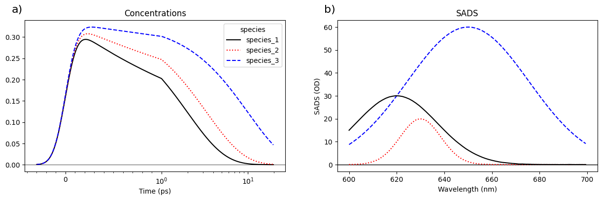
Let’s create a custom plotting function that combines concentration and spectra plots side by side, using a custom cycler we build from what we learned above.
from cycler import cycler
from pyglotaran_extras import plot_concentrations
from pyglotaran_extras import plot_sas, add_subplot_labels
from pyglotaran_extras.plotting.style import PlotStyle
import matplotlib.pyplot as plt

custom_cycler = PlotStyle().cycler[:3] + cycler(linestyle=["-", ":", "--"])


def plot_concentration_and_spectra(result_dataset):
    fig, axes = plt.subplots(1, 2, figsize=(15, 4))
    plot_concentrations(result_dataset, axes[0], center_λ=0, linlog=True, cycler=custom_cycler)
    plot_sas(result_dataset, axes[1], cycler=custom_cycler)
    return fig, axes


fig, axes = plot_concentration_and_spectra(ds.isel(time=slice(100, None)))
axes[0].set_xlabel("Time (ps)")
axes[0].set_ylabel("")
axes[0].axhline(0, color="k", linewidth=0.5)
axes[1].set_xlabel("Wavelength (nm)")
axes[1].set_ylabel("SADS (OD)")
axes[1].set_title("SADS")
axes[1].axhline(0, color="k", linewidth=0.5)
add_subplot_labels(axes, label_format_function="lower_case_letter", label_format_template="{})");
Tip
To reduce repetition check out the documentation on using plot config and
how to use it for your own plot functions (use_plot_config).